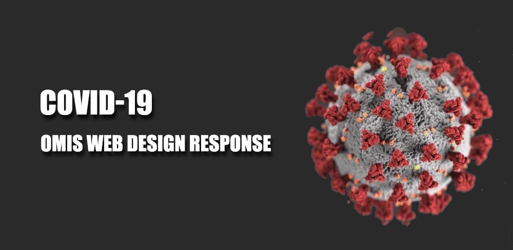
2018 WEB DESIGN TRENDS & WHAT TO EXPECT!

Just like the hockey finals or the Oscars and the Grammy’s, every year someone wants to show off their latest fashion, gadget or accessory. Some of these choices are popular and become a trend (dare I say “men with beards” or those crazy new hover boards…) and others simply fizzle away.
When it comes to website design, it’s important to keep up with the trends as well! Animated gif’s on your website are not cool anymore! As the internet becomes more widely accepted and as people grow into using the internet for researching, shopping and learning, consumers will be more educated on how websites should look and work and what websites to avoid (for example, would you shop online on a website without SSL encryption? Or if it said Copyright 1997 at the bottom?)
Here are the trends we believe will take off in 2018 and get a lot of customers asking for web design updates! These trends are based on the recent research, usage statistics, surveys and even some keen observation as to what the bigger players are doing!
QUICK TO THE POINT CONTENT:
Yes we all know that having a lot of content is great and helps for search engine optimization but unfortunately, it doesn’t really benefit the user. In fact, we’ve found that only 7 to 10% of the content is read by users during an average visit. For example if the entire content on the website would take 10 minutes to read, the average user would read only for 1 minute!
That being said, I’m not saying to cut your content down by 90% but rather consider re-organizing the content based on the interest of the user. A short call to action button that opens to a page with 2-3 selling points that can be clicked on if they want more information… Keep the website small but enable the website to easily expand based on the user interest.
Remember that users still don’t like to scroll so keep all the content neatly organized with lots of links. You can use sub-category links, accordions, tabs and another methods to keep the content clean and organized with the ability for the user to “expand” when needed.
RESPONSIVE WEB DESIGN:
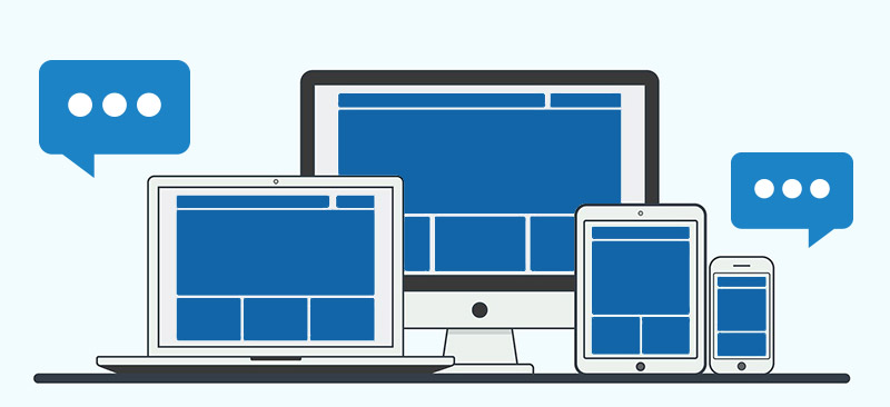
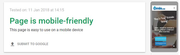
Yes you’ve probably read this as a trend for the past couple of years but it’s amazing how many companies still ignore ensuring their a responsive website design! Adding up all our statistics from all our clients, we can comfortably say that a whopping 47% of users access website via a mobile device like an iPhone or a Samsung Galaxy including tablets! That means if your website is built not to be mobile friendly, you will lose nearly half of your visitors! We highly recommend taking the Google Mobile Friendly Test
If you also manage your website statistics through Google Analytics or any other software, compare the session duration of each device (for example desktop, mobile, tablet). It’s expected that people spend less time researching on mobile compared to desktop but if you see your session duration of your mobile device to be less than 50% of your desktop session duration, the odds are it is due to mobile issues. For example if the average user spends 5 minutes per visit on desktop and less than 2.5 minutes on mobile, you will need to address how your users interact on your mobile website.
SUBTLE ANIMATIONS & MOVEMENTS:
If animated GIF was the coolest thing in the 1990’s, then behavioral CSS (Any style that changes based on the user’s actions like “hover” and “click) has taken it’s place for the past couple decades. However, just like animated GIFs you can only put so many actions and behaviors on links, images and buttons. It’s important to note that the key takeaway point the importance of having some “life” on your website in the form of movements and animations. We will soon see a more natural blend of behavioral CSS and embedded animations whether in the form of CSS, script and yes! Even smooth, clean professionally designed animated gif images! These animations can be added as your logo, a background accent in a content section or a headline section. This element will take the burden off “on hover” animations and will create a more fluid website that looks like it’s breathing!
Another great way to add a subtle movement is through parallax background images. Parallax scrolling or movement is basically an effect where the background seems to be moving at a different speed/rate than the foreground (See an example near the bottom of this page… As you scroll down the image of the house also scrolls!). This effect gives the website more depth and a three dimensional feel.
PERSONALIZED IMAGERY AND STOCK PHOTOGRAPHY:
I’m willing to go on a limb and bet that nearly everyone who is reading this article has seen a picture with Rebecca Ariane Givens that famous model whose face is seen across millions of ads from thousands of companies. Right away, the impression you get is that the image is fake or a stock photography which denotes a “cheap” feel. As more and more of these “popular” stock images make the way across the internet, there will be more of a need to have personalized and unique imagery on your website. Quite often, for less than $500, you can have a set of professional photos of you, your business, your services and products which will make a great and unique first impression. There are also many artists’ works that can be found online for licensed use of their work.
Quite often these images can also be leveraged across other marketing or decorative needs within your business such as flyers, postcards, signage and posters. This will help keep branding consistency across all your points of contact from your website to your brick-and-mortar location and also social media sites.
REAL-TIME ENGAGEMENT:
Real-time engagement is a chat service that is offered to online visitors to your website. As you detect a visitor landing your website you can decide to send a personal message in case they have questions or need help. If they respond, it becomes a chat session! Think of the last time you walked into a boutique, shop or quaint little store. How long was it before a staff member approached you for help or if you had questions? From our experience and statistics, it seems that nearly 60% of us actively respond when approached through real-time engagement or “Live Chat”. As an added bonus, if the “chat” profile is personalized with an image, name and position (For example Joe Smith, Project Manager / Owner / VP Marketing) the conversion rate (how many potential clients were turned into contractual clients) doubled!
There are various real-time engagement services available. Our preferred platform is offered by Zoho and the software is called Sales IQ . You have the option of desktop or mobile notifications with a super easy setup and is fairly quick to learn. For those businesses who have a full-time receptionist or someone managing social media or website content, this is an excellent opportunity to engage with more users and convert more leads.
OUT OF THE BOX DESIGN
We’ve all grown accustomed to have certain expectations when visiting a website. The logo is at the top left. At the bottom of the page is the footer with all the site links, contact details and perhaps even address or map. Again at the top you’ll have the navigation with a home button and a contact us button. These predefined expectations are all excellent ways to engage with your customers and will improve usability but one thing we’ve learned is that as we become a more and more tech-savvy generation, we become faster at learning new little shortcuts or functionality. For example, I’m willing to guess most of us know that the “drawer icon” (an icon like this: ) represents a menu or that a magnifying glass implies a search function.
Trying to think outside the box and create a unique layout or website structure can be a clever way to stand out from your competition. We have many clients with a “one-page” design that doesn’t follow conventional layout standards. This unique approach matches closely with the company’s branding message and creative approach to delivering their services.
We feel the traditional “theme-looking” website layout will slowly disappear. Businesses will want to create a truly unique web-browsing experience reflective of their brand and quality of service. For example, those in the real estate industry, might focus on showing big images of available listings with search filters and making navigation and logo secondary. For photographers, salon/hairstylers, landscapers or any other industry where your work can be seen consider a photo-based layout with clean wording over top of images to help guide the user (to book an appointment, get a quote or see rates). Quite often, thinking about your product or service and presenting it as the focal piece of content can often drive how you lay out your website.
GENERATE THE LEAD FIRST DESIGN
This one is a mouthful so let me break it down. Websites like Netflix or Pinterest have this type of design. Where you are basically locked out of the “real” website content until you register, sign up or link your social media accounts. The intent is to immediately generate a lead – or capture your contact details – to begin communication or the sales generation process.
Quite often generating a lead is the most important part of the sales funnel process. It allows businesses to provide a more detailed or curated content to the user based on their activity on the site. We quite often see this on websites that offer a free eBook if you sign up or register for a free trial. Although generating a lead is extremely important, there are certain industries and businesses that could really see a dramatic drop in sales if this design is used. Web Design Companies for example! Website designers offer a very broad service with a lot of options and components. Unlike Netflix where the user wants to watch a specific show or movie. As a web design company, I need to convince the viewer of my services through our portfolio, testimonials and obviously, service details. Asking the user to sign up / register to see this content would make them hit the back button and choose the next website in the search results! However websites that offer online services, subscriptions, recipes, news/information have a great model to support this type of website design.
CRYPTOCURRENCY PAYMENTS
Cryptocurrency was a very hot topic in 2017. You might have heard of the new “digital currencies” like Bitcoin or Ethereum, Ripple and Litecoin. There is an increasing trend of usage of crypto-payment systems for delivery of services. Whether you sell clothing, virtual goods or subscription services, you can let your users pay with a choice of cryptocurrency. Regardless of which cryptocurrency will prevail in the future (remember about 20 years ago all the web browsers we had?) leveraging a platform that enables crypto-payments will be a highly sought-after feature on your website. In fact, the highly popular Shopify, “DIY” website builder already has modules for your website to accept crypto payments!
WHAT WE AT OMIS.ca ARE EXPERIMENTING WITH
Here at OMIS.ca, we are always finding new ways to deliver content, build websites and improve the way our clients’ customers engage with their users. With the growth in popularity within social media websites, news and podcast apps and switch towards mobile web-browsing, we believe web design will become fragmented with various content stored within various locations. For example Facebook would be used as an avenue for users to learn about company news, promotions. Instragram / Pinterest / YouTube as the “portfolio” or visual component for a business and a website like LinkedIn or BBB as the testimonial component. All of the above-mentioned sites also offer a communication/chat service within them rendering the need for a contact form on your website obsolete.
As mentioned above, more and more of us are becoming more and more mobile savvy and spend more time on our mobile devices shopping, researching, learning and inquiring on a daily basis. By creating a clear landing page (on your website) directing the user to the appropriate channel based on their request News? Podcast? Image Gallery? Video? Content?) we can keep redundant or duplicate (unseen) content off the website. This not only allows you to keep your website clutter-free and organized but also allows you to leverage the benefits of social sharing from social media website like Facebook and Instagram.